Thursday 30 September 2010

Music Video Analysis by Jade Podmore


The JCB Song by 'Nizlopi'
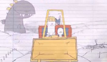
The video is based upon the drawings of a child as he tells the story of his father and riding in his JCB at the age for 8. The drawings are simplistic to represent a innocent, childish point of view.  This is emphasised by the background which looks like a piece of lined paper with a margin, resembling a a child's school work book.
   
At the beginning of the video, we see a drawing of a man sitting at a desk in a cluttered office. There is a pan shot that shows us the cluttered office. This sets the scene and give us the impression that the man is dissatisfied with how his life is now and is thinking about his childhood. This is emphasised by the use of dark colours within the drawing. As the man then leaves the scene, the video is edited by a cut  to an over head shot of a work book. The camera then zooms in so that the page of the work book fills the screen. It is here that the mood of the video changes with the use of much lighter colours and the music begins. 
 Although there is little editing within the video as a whole, the editing that is used aims to represent the transition between adulthood to childhood through a memory and so is still very effective and essential to telling the story of the video.
To begin with, the song is slow and steady with a constant beat. The video is synchronous to this as it is a continuous flow of picture animation that represents a road on which the JCB is driving along. This however changes as the pace of the music changes. The song is sang Acapello for three repetitions of 'Im Luke, Im 5 and my dad's Bruce Lee', during which the JCB in the animation stops moving. This then changes again as the pace of the music increases and the instrumental layering of the music increases from a single guitar to a full band of drums, guitar and bass guitar, during which time the JCB becomes a flying machine and the characters in the video fly off into the sunset. The video finishes at the same time as the music and so is synchronous throughout the entire video as it stop as and starts according to the texture and pace of the music.


Gregory and the Hawk - Ghost

This is a video created using the Stop-Start animation technique, a technique that has become very popular recently within music videos as it is seen as being something quite different or unique because of its 'quircky' style and simplistic charm. This video is however very unconventional. Although it uses all the same techniques that most Stop-Start animation videos use, is seems to have no real connection to the song in the sense that is does not convey the intended message of the song. However, the band 'Gregory and the Hawk' are most certainly not considered a 'main stream' band and so they are allowed to break the boundaries of convention, also this means that their budget for projects such as music videos is very limited, this is made obvious in their video for 'Ghost' as it has been made with only one camera, it has no complicated editing or special effects. This however does not hinder the video at all, in fact it only adds to the simplistic, childish feeling of freedom, fun and individuality that I feel they are aiming to be associated with. I think that the way in which the video has been made is partly intended, as Gregory and the Hawk's music is very original, quite unknown and does not fit the desired 'main stream' image. I think that Gregory and the Hawk are proud of this identity and have tried to cater this music video to fit that.      
      The sound is synchronous to the video as the song is fast paced throughout, as is the video. The video increases in its pace of editing as the texture of the music becomes thicker and increases in volume towards the end.  
    The stop start animation is very fast paced and makes the audience feel slightly disorientated, the use of natural high key lighting and bright coloured clothing also does this. Repartition of scenes is also a feature of the editing that creates a slightly 'eerie' feeling sot the video, especially when a girl within the video is seen climbing down a steep hill in a forest bare foot wearing a white dress. It is only here that we get a representation of the 'Ghost' that Gregory and the Hawk are talking about. However, there are small hints towards the idea of ghostly figures through mise-en-scene. As part of the costume in the video, hand-made masks are used to cover the faces of some of the people. Combined with a number of extreme close ups, and the abstract costume and scenes within the video, a feeling of acute fear is created when watching the video. The video is very surreal; the extreme close ups are unexpected as the nature of the stop start animation means that they can cut to an extreme close up immediately.       


Kate Nash - Foundations


This video is quite similar to the Gregory and the Hawk video as it features stop start animation in a real life environment. Again, Kate Nash is aiming for a 'quirky'  representation of the break of  a relationship. inanimate objects are used to represent a man and a woman, for example there are two watches that move from being entwined together to moving away from each other and lying down. This represents a relationship breaking apart, where every feature of the people involved, (for example their clothes and belongings) are complete opposites and the distance between them is getting bigger. 
    The camera is always zoomed in on the action with a close up or severe close up, the image is also often off centre, but ignores the rule of thirds. This gives the feeling of chlaustrophobia which is emphasized by the Kate Nash's lyrics. The off centered and canted camera angles represent the relationship also being 'off-centre' or slipping out of focus. 
    The video is synchronous to the music. The camera uses fast paced editing through cuts to tell the story of the lyrics. This is true throughout the video and is especially noticeable at the beginning where there is a a series of single piano chords and the camera cuts between close ups of Kate Nash to  similar close ups of the man in the video who the song is directed at.  
    The colour filter used throughout the video makes the bright colours look far less vibrant. This represents the relationship, portraying the way in which the relationship has become dull and boring when it was once vibrant and colourful.


For our music video, we intent to use the Stop Start technique and so are aiming for something along the same lines as the 'Ghost' and 'Foundations' video. it is interesting to compare the two different types of animation I have analysed. They both aim to portray an idea of simplistic 'quircky-ness' that gives the artist and the video an identity an of individuality and despite being so very different in their style of doing so, they all achieve this.

Album Cover and Album Advert Analysis by Jade Podmore


Album Covers


1. This is the album cover for Gregory and the Hawk's album titled “Moenie and Kitchi”. The album features the song “Ghost” which I have analysed a part of my coursework. The album features typical conventions that are often used for album covers. For example, the cover features the name of the artist and the name of the album at the top and centre of the cover. The band name is written in a front that is always used for this particular band, this make the album very specific to the band and makes the buyer of the album aware that they are purchasing the correct album. It is also a way for the band to create a sense of continuity and identity; it is their individual way of presenting themselves that creates a feeling of ownership and inclusiveness for the buyer and the band. The positioning of the Album name and Band name is important; it can be seen very clearly due to its separation from the album art, the use of a different font and the use of colours that stand out against the background. The type of image used is also very important. The use of a drawn image instead of a photographic image creates the feeling of innocence and childhood, this is emphasised by the drawing itself. For example the way that the little girl is standing, her clothes, her hair style and the childish images such as the butterflies and kites creates a feeling of nostalgia which has probably been done as a way to represent the type of music, feeling and message that Gregory and the Hawk are trying to portray. The use of a heart shape to contain the whole image is also significant, especially as the popular understanding of a heart shape is to represent love, but the use of the heart shape in this image seems to create a feeling of acute sadness which is emphasised by the neutral colours and the drawing of the child with her back to the viewer.

2. This is the album cover for Kate Nash's album titled “made of bricks”. The album features the song “Foundation” which I have analysed as part of my coursework. The album features typical conventions that are often used for album covers. For example, the positioning of the Album title and Artist; they are front and centre of the album cover, separate from the album art, this again is done to make the artist and album stand out against other albums and draw attention to Kate Nash's album. The use of a childish front that makes Kate Nash's name look hand written creates a feeling of childish freedom. This feeling is emphasised greatly by the image used in the album art. The house is very typical of the way a child would draw a house, with the use of trees, flowers , a big front door and winding path. The house resembles something from a fairytale of story book, for example Alice in Wonderland or Little Red Riding Hood. This is emphasised massively by the photographic image of Kate Nash skipping up the path, wearing a red dress, holding her dress up and looking back with an expression of wonderment and curiosity. This as been done to send a message of freedom, creativity and imagination; the identity that Kate Nash is trying to achieve through her music and the message she is trying to send to her audience. The album cover is fun, colourful and relatable to the audience as they feel excited by the idea of fairy tales and become nostalgic for childhood. This is an interesting link to the album cover for Gregory and the Hawk's album as they are both apart of quite differing genres, but share similar values and try to achieve a similar identity.

3.  This is the album cover for Nizlopi's self titled album “Nizlopi”. The album features the song titled “the JCB Song” which I have analysed as part of my coursework. This album cover is very similar to the two previous album covers I have analysed. It achieves the same nostalgic feeling of childhood and childish simplicity to project an identity of freedom and happiness. This is partly due to it's reflection of the featured song “the JCB Song” which tells the story of a five year old boy who adores his father, who drives him around in his JCB. The childish perspective of the song influences the album cover greatly unlike Gregory and the Hawk and Kate Nash, who adopt this identity without the influence of a feature song. This album cover uses a child's drawing as the main image, much like Gregory and the Hawk However the drawing of the JCB is far more reflective of a childs hand and creates a sense of contentment rather than sadness which is conveyed by the image used by Gregory and the Hawk. All three albums share the childish font to draw attention to the artist and album title, suggesting that all three aim to achieve a similar identity. Nizlopi and Gregory and the Hawk are apart of similar genre's focusing on achieving a simplistic acoustic sound and so their similarities can be expected.


Magazine Advertisement Analysis

Paul Weller
This is an advert from the Music Magazine 'Q', it was advertising Paul Weller's new album titled “22 Dreams” released in 2008. It features the artist name and album title positioned front and centre of the advert, this has been done so as to draw the eye of the consumer straight to the advert and allowed them to instantly recognise who and what is being advertised. It is interesting to notice that the artist's name is in a bolder font than the album name. This could have been done as a way to emphasise the identity of the artists as a being bold and different this is also demonstrated by the font colour, that stands out against the multi-coloured background. This has been done for a number of reasons. Paul Weller's name has been typed in bold because of the magazines close association and loyalty to the artists. Weller has appeared in Q countless times throughout his career, meaning that the magazine sees him as the main selling point of the album rather than the name. It also creates the idea that Paul Weller and his album “22 dreams' as something that will stand out in a very hectic and crowded world as something clean, bold and new. The background is also a way of portraying the desired identity of both the artists and the feeling that is created by the music on the album. The garden has been painted to represent a dreamlike, picturesque, colourful idea of freedom, emphasised by the wild flowers overgrown trees and grass and wildlife. It is trying to emphasise that the album is aiming for what Weller feels is perfection, and his biggest dream is to reach this place of freedom and tranquility through his music/ The album invites the audience and consumer to think about what their biggest dream is and aims to inspire them to reach it through Weller's music. The audience and consumer is supposed to respond with a feeling of uncontrolled freedom with no boundaries. This is done to reflect the desired meaning of the music.
The section of the advert containing the practical information about the album is cut off from the rest of the advert with a thick black box. This allows the audience or consumer to focus on the two sections separately so as to respond to and understand both section completely. Also, the information tells the consumer that they are getting more for their money, this is important to loyal life long fans of the artist as they desire the memorabilia and the feeling of getting more for their money. This therefor increases loyalty and may ever widen Weller's fan base if new fans associate Weller as being an artist that offers more to his fans. This will increase interest from the consumer and persuade them to buy the album more so, as their interest and understanding is maintained.


Gwen Stefani


This is an advert for Gwen Stefani’s album titled “Love. Angel. Music. Baby” released December 2006, taken from the magazine ELLE in 2006. The advert features the artist’s name and album title in a font which is always used in advertisements for Gwen Stefani merchandise. This is important as it give Stefani and identity that is recognisable and individual to her brand. This means consumers, fans and audiences become apart of the brand identity and remain loyal as a fan base through continuity and recognition. It is also important to notice that the artists name is in a much larger font than the album title. This has been done for the same reason as it has been done on the Paul Weller advertisement above. Gwen Stefani is the number one selling point for the album as consumers recognise her as the main reason to buy the album, rather than the name.
The image used for the advert has been distorted to resemble a ‘house of mirrors’ reflection. However this effect has only been applied to the background of the image, and the very edges of the image of Stefani, leaving the main image of Stefani clear. This may have been done to allow Stefani to stand out against the background as again, she is seen as the main attraction to consumers who the album is aimed at, and so it is important that she is easily recognised. Also, it could have been done to create an identity of perfection against an imperfect world, making Stefani seem perfect; this is reflected on the audience also, as they will feel that they too are closer to perfection for buying the album and feel connected to Stefani as a fan. In the image we see Stefani holding a crown and staff that represent her as been Queen or Princess like. This gives her an identity of power and status, something that she is recognised within the media for, as she is given the title ‘Queen of punk pop rock’. It is also connected directly to songs featured on the album such as “Rich Girl”, which tells audiences of Stefani’s dream to have “all the money in the world”, something she could have if she were a Queen or Princess.
Within the magazine advert, we see a smaller image of the actual album cover. This has been done so as to inform audiences that the album does not look the same as the advert, so that they are able to recognise the actual album in-store. It also shows the rest of the image which is missing from the advert. The complete image shows Stefani looking less glamorous, (striking a suggestive pose and wearing tight denim hot pants and braces) than she does in the advertisement. This is interesting when considering what magazine the advert is taken from; ELLE is a glamorous fashion magazine and so would avoid showing a large picture of artists like Stefani (who they associate their magazine and audience with) looking less than perfect and glamorous.
The practical information is typed in the same font as the rest of the advert, making it less noticeable, unlike the Paul Weller advert above. This is due to the large size of the main image that fills most of the advert and is considered a more valuable selling point as audiences will want to buy the album based on the image, rather than the information about the album. However, song titles are in a larger font as audiences will recognise these from radio, TV and chart lists; this will provide them with enough information for them to want to buy it, if they like these songs.  


The Vines
This is an advert for ‘The Vine’s’ album titled ‘The Best of the Vine’s ‘released early 2008, taken from ‘Q’ magazine. The album features the artists name and the album title in the centre of the advert. This is has been done to draw attention to the artist name; this is emphasised by the large bold font and the use of capital letters. This however, is always the case for ‘The Vines’ merchandise. This, much like the Gwen Stefani advert, is so that a continues, recognisable identity is given to the band, this means consumers, fans and audiences become apart of the brand identity and remain loyal as a fan base through continuity and recognition. This advert is also very similar to the two other adverts I have analysed because of the use of a much larger bolder font for the band name in comparison to that of the album title. This has been done for the same reason as it has been done for the Paul Weller and Gwen Stefani advertisements above. ‘The Vines’ are the number one selling point for the album as consumers recognise them as the main reason to buy the album, and are attracted to buy the album by them rather than the name of the album. This is especially the case for this particular album as it is a compilation of The Vine’s greatest hints. This means that fans will most probably already have heard or own the songs which are on this CD, and so are buying it because it is ‘The Vines’ merchandise, rather than because it is new material or an album they are attracted to by its title.
The graphics and colour scheme that are used are simple, and reflect the band name rather than the intention of the album, unlike the Paul Weller and Gwen Stefani adverts. This again has been done because ‘The Vines’ are the most important thing about this album as the songs have already been heard by a large fan base. The designers of the advert know this, and so have aimed to attract audiences through the representation of the band itself as a brand rather than the album as a whole. However, the green used for the drawings is incredibly bold, giving the band an identity that stands out against the plain white background, and so it does reflect the music of the ‘The Vines’ to be bold and out standing.
The practical information is separated from the entwining vine graphics and is typed in a font that is distorted, making it look as if it has been scratched or worn away. This has been done to give ‘The Vines’ an identity of a certain edgy-ness. Much like the Gwen Stefani advert, the song titles are typed in a bold font with the use of capital letters. This has been done for similar reasons to the Gwen Stefani advert, as these are the songs that the band is using to attract their audience. This is particularly important for this type of album as the fans will have heard these songs before and so ‘The Vines’ are hoping that it is these songs which have been favourites in the past and will attract the fans on the basis of loyalty. It is also interesting to notice that the audience are made aware that there is an exclusive bonus track available on this CD. This is important as it pleases fans to know they are getting something ‘exclusive’ for their money and increases loyalty. It also means that fans will be more inclined to buy the album as they won’t just be buying songs they have heard before, but be buying something completely new and unheard as well. Also, letting audiences know the song can be downloaded is important, as it means even if they buy this particular album because of the exclusive song available, it means they may be inclined to download it as a single song. This means that audiences are still being given new material to listen to, increasing fan base loyalty, and the band still have the opportunity to make money through download sales.